RESPONSIVE WEB DESIGN_
A mobile first world means that every new website must be responsive.
It almost goes without saying that a modern website needs to be responsive. If you want your business to have a digital presence then you need to make sure that users can get the full experience on mobile, tablet and desktop.
Mobile phones are the most popular devices to use and desktops come in at a close second, so you’ll want a site that’s usable and scalable for the various screen sizes and browsers that are available. Your users are your #1 priority, so it’s essential that you make sure that they’ve got a consistent experience no matter what device they use.
That’s what we do. We design sites with the user in mind. And as mobile-friendly sites are a must-have, we plan how your site will look on a mobile from the start. Our designers know their stuff, they’ll build your website to be responsive and test it to make sure that it works. We’ve designed hundreds of responsive websites and we’ll build a high-quality, professional site that makes your business look great.
While it does take a bit more time to build a responsive website, it will save you money in the long run because you’ll only have one website to update, develop, and optimise for search, keeping future development and digital marketing costs down.
We plan ahead and think about your target audience and how they’ll engage with your site. And, during the design stage, we’ll show you wireframes and full-colour mock-ups for desktop, tablet and mobile, so you know exactly how it’ll look.
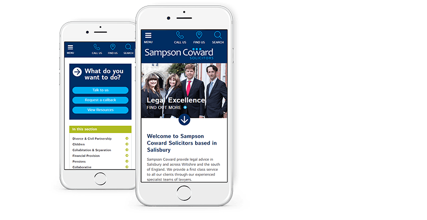
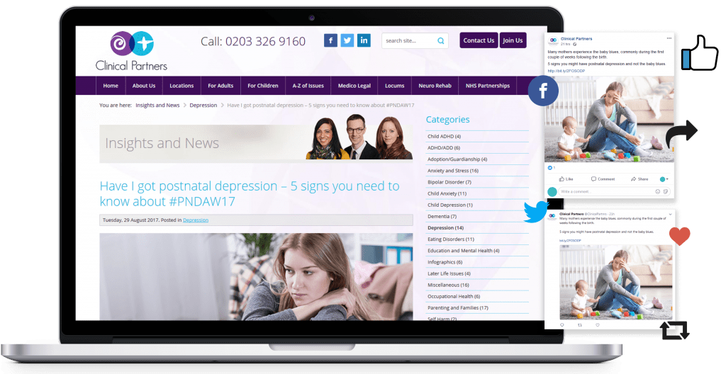
Design that responds and adapts itself for optimal viewing on multiple devices, like desktops, tablets and mobiles.
We run our projects using an accredited quality management system and our QA team will test the site on multiple screen sizes, devices and browsers.
Keep your site looking great and create a consistent user journey across all devices.
A fully functional and easy to use responsive design will help make your business look modern and professional in the online marketplace.
A responsive design is optimised for mobile-first indexing which is what Google wants. Therefore you’re more likely to rank better than your competitors who don’t have a responsive website.
You’re more likely to get views and shares if you’re sending users to a responsive website that is quick and easy to use.
To find out more about our services and
how we can help your business
please get in touch.
User friendly and mobile friendly CMS, the platform millions of websites are built with.
find out moreModern websites are designed and built around a content management system.
find out moreOur knowledge in usability, accessibility and visual design will enhance your users experience.
find out more